Landing pages are critically important for a SaaS product. How fast does it convey the value proposition of the product? Does it make potential users move down the conversion funnel? What's the conversion rate? These are the questions which many product people fret about.
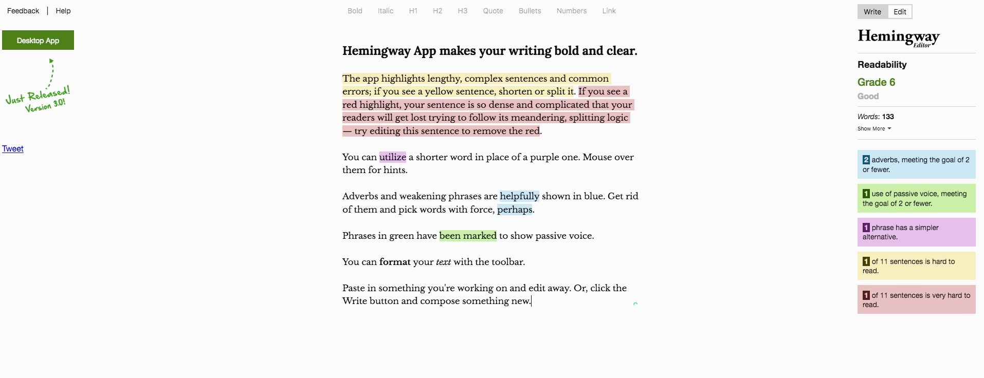
One such brilliant landing page I stumbled upon recently is that of Hemingway Editor. In fact the landing page is itself the app and the demo.
 Landing Page of the Hemingway App
The prefilled text tells you what the app does - and demonstrates it live. It shows features like analyzing complexity of the sentences, adverb usages, etc. And once you have gone through the text, you can just edit the passage to test your own writing.
- The landing page, the demo and the product are the one and the same!*
The only other CTA is to download a desktop app, which is on the left top corner. It attracts attention because of the handwritten text font and the dotted arrow. It's as if your teacher is pointing something to you. You can't dare but take notice.
In the world of SaaS landing pages, this is the Zen state. Very hard to achieve. But this is simplicity personified.