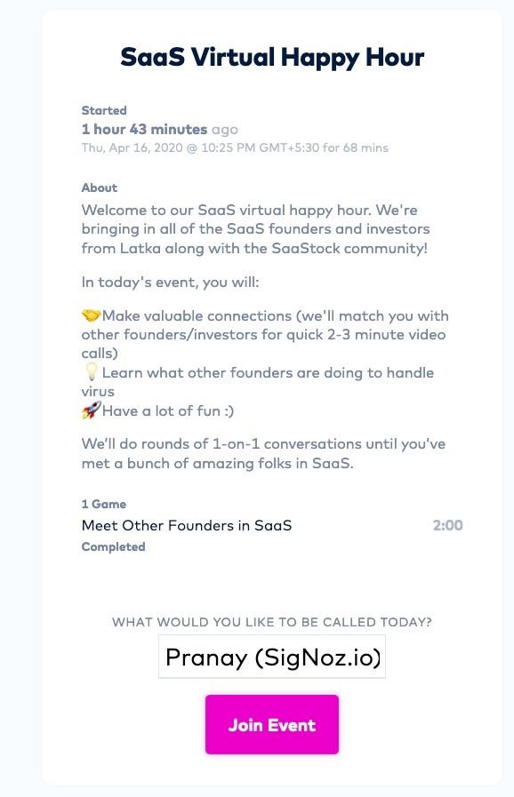
Today I attended a SaaS Virtual Happy Hour meetup organized by Nathan Latka of GetLatka. It was a really fun event. The attendees were SaaS founders and investors. Every few minutes you would be paired with a random person in the group and you will chit-chat for 3-4 minutes.
There were ~70-80 people who were live for ~1 hr event. I met 5 people from different corners of the world. Poland, London, New York City & Germany. Two of them had recently been to India. One even has a dev team in India.
It was curious meeting people from different parts of the world whom I would not normally meet. You could say that 3-4 minutes was a very small time to chat on any thing in detail - but it was good to get to know about the other person.
The session was powered by this SaaS product - https://icebreaker.video . Do check it out.
A remote only world is creating new platforms and formats of interaction. It is also making the world flatter. Since, there are no local meetups now, I can now attend any virtual meetup, webinar happening around the world.
For someone who is building a global SaaS product, this is really a blessing 😀

New formats of virtual interaction are emerging with extended lockdowns :)
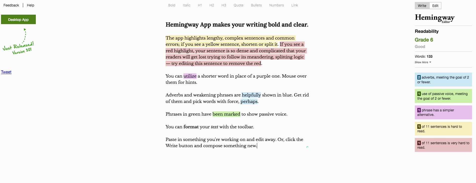
 Landing Page of the Hemingway App
The prefilled text tells you what the app does - and demonstrates it live. It shows features like analyzing complexity of the sentences, adverb usages, etc. And once you have gone through the text, you can just edit the passage to test your own writing.